
NDA Notice:
This case study uses abstracted or representative examples to illustrate design approach and decision-making rather than proprietary systems or internal documentation. Public-facing work is shown for illustrative purposes only.
Role
Lead UX Designer
Product
Enterprise Infographic Framework (Design System Extension)
Timeframe
Summer 2022, 2–3 Sprints
Team:
Cross-functional collaboration with product manager, business analyst, engineers, QA’s, content, marketing partners, UX Leads
Tools:
Adobe XD, internal CMS, accessibility testing tools (VoiceOver, WebAIM Contrast Checker), WCAG documentation
A Small Request With a Bigger Problem
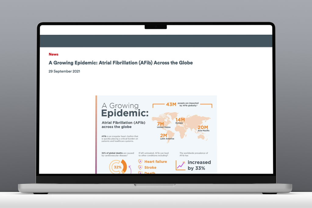
Marketing wanted an infographic published immediately on their site. It was a flat image packed with insights from a large global study. This was the kind of content that earns shares, citations, and backlinks. The design was done, their timeline was tight, and they just needed our team to push it live. I said yes reluctantly, already seeing how it would quietly work against everything they were trying to achieve:
- On mobile, the image would be nearly unreadable
- Screen readers would find nothing to scan
- Search engines would index the file but not the content inside it
- Any future update would have meant rebuilding the whole image from scratch.
For me, the real issue was reach. Locking that much valuable research into a static image meant it was effectively invisible to users with access needs, and to the search engines that would determine how many people ever found it. The content was strong, but the format was about to bury it.
The Real Opportunity
Before flagging issues and moving on, I wanted to understand what the team was actually trying to accomplish. They wanted to promote a conference tied to the research, drive interest in related content on the site, and get the work discovered organically. That last goal opened the conversation.
I asked how they expected people to find a flat image through search. Being marketing professionals, the SEO implications landed immediately. Embedding this much content in a static image was effectively hiding it from search engines. The case made itself: if the goal was reach and discoverability, the format was working against them.
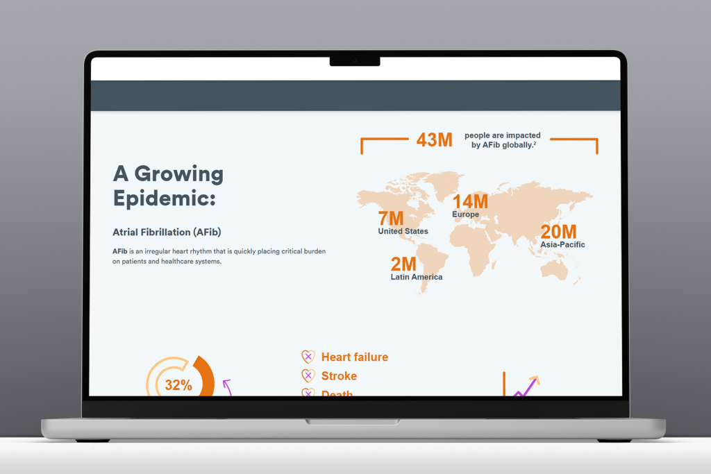
Once the SEO point clicked, they were immediately on board with exploring a different approach. I proposed a flexible, live solution that would be searchable, scalable, and built to grow. They aligned quickly, especially knowing more infographic content was planned ahead.
With stakeholder support secured, I brought the proposal to the other project design leads — presenting the use case, my proposed solution, and the platform-wide benefit of building a reusable framework any team could use to present visual data in a flexible, accessible, on-brand way. During the meeting, I facilitated a quick brainstorm that surfaced additional use cases from other team leads, which I used to strengthen the prioritization argument. Nothing like this existed in the system. I made the case that it should, and got the buy-in to build it. What started as one marketing request now had a clear case for becoming a system-level capability.
The Goal
Transform a one-off accessibility risk into a reusable system solution, enabling infographic content to be built using modular, WCAG-compliant components that improve accessibility, SEO, and scalability across all supported brands.
Finding the Solution Inside What Already Existed

My first instinct was to look at what the design system already had. An existing card-based module showed genuine potential. The structure was close to what an infographic layout would need, but too rigid for complex data storytelling.
Before touching a single screen, I brought engineering into the conversation to understand what the existing module could realistically support and where it would need to flex. That early alignment meant we weren’t designing into constraints we’d only discover during development. This was a decision that kept the project on track and avoided costly rework later.
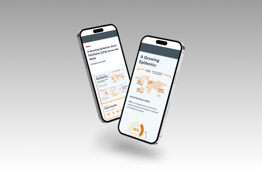
What I designed was an enhanced version of that module — purpose-built to handle the range of configurations infographic content actually requires. Every decision served a specific outcome: flexible image and text configurations to support varied content types, a non-carousel layout to preserve logical reading order for screen readers, and scalable card layouts that could flex from a single stat to a full data narrative. The result was a component that worked for content teams, met compliance standards, and could scale across brands without redesign.
Accessibility was a constraint from the start. In collaboration with engineering: real text instead of embedded image text, semantic HTML structure, keyboard-accessible interactive elements, and meaningful alternative text throughout. These decisions improved both compliance and search performance across devices and assistive technologies.
Getting Teams Across the Finish Line
Building the component was one part of the work. The other was making sure teams could use it without calling a designer every time.
I recognized that a well designed component wouldn’t be enough if teams didn’t know how to use it, so I developed a comprehensive infographic toolkit designed to make content teams self-sufficient without needing to pull in a designer for every request.
I walked the content team through the toolkit in full. The volume of questions told me the guidance was landing. For business partners, I focused specifically on asset preparation and handoff, making sure they understood their role in getting the right file types to the content team. Across stakeholders, the toolkit was received as genuinely useful. System documentation was updated across platforms, with open office hours available for ongoing questions.

What It Added Up To
A WCAG-compliant infographic framework — reusable across multiple brands, maintainable by content teams without developer involvement, and built entirely on an existing system component. Content that had previously been locked inside a flat image was now live, searchable, and indexable. Teams could update infographic content without filing a developer request. And the framework was built to scale — meaning the next team with an infographic need had a starting point, not a blank page
The toolkit generated interest from teams well beyond the original request. Which was the point.
What I Learned
A flat image was easy to ship, but building something that would serve teams better for years required broader thinking. It’s the kind of investment that’s worthwhile, especially when two other teams later adopted the framework without any design support, which was exactly the point.
The key takeaway for me was to start with the goal, not the deliverable. The team came to me with a finished design and a simple request to publish the content. Instead, the more important question was if this format would actually work for what what they were trying to accomplish? Asking this instead was what changed the entire trajectory of the project, and prevented a valuable piece of research from being buried in a format no one would find.