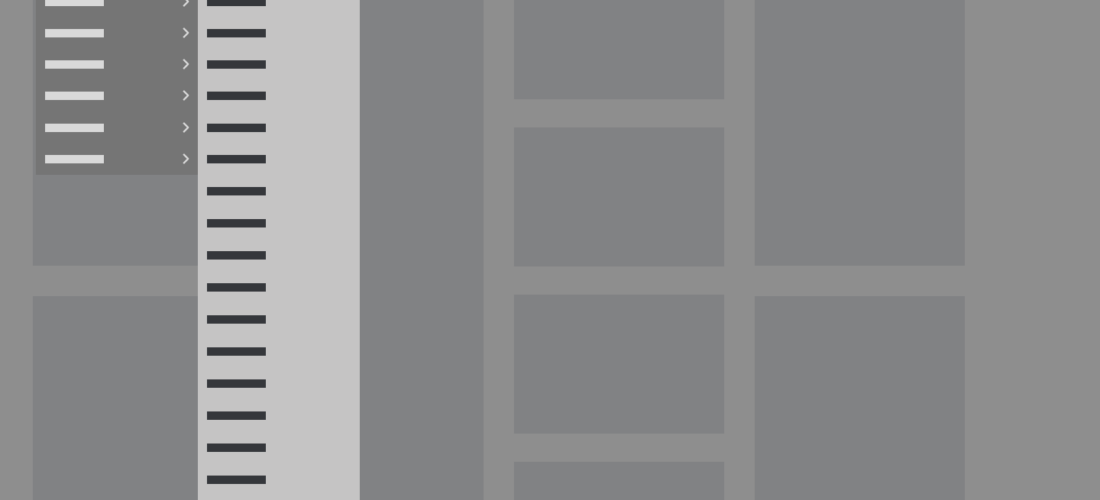
Wireframe of a CMS submenu expanded, showing an example of a long, uncategorized list of menu items.

Championing Usability, Behind the Scenes

Wireframe of a CMS submenu expanded, showing an example of a long, uncategorized list of menu items.

Role

Lead UX Designer

Product

Enterprise Design System CMS (Internal)

Timeframe

~3 sprints (balanced alongside core product responsibilities)

Collaborators:
Product Managers, Business Analysts, Developers, QA, Content Editors, Designers, Marketing Partners

Tools:
Enterprise CMS platform, design and prototyping tools, internal documentation and collaboration tools


The Problem Everyone Had Learned to Live With

When you work inside a tool long enough, you stop noticing how broken it is — or you notice, but you’ve already built the workarounds, so you stop expecting it to change.

This was a significant issue that plagued the design system’s internal CMS. I used it regularly for testing component functionality, verifying that designs rendered correctly, and checking that guidance aligned with what the system could actually produce. Over time, I began to notice what colleagues had already noticed but accepted as unchangeable: the tool had become genuinely hard to use, and no one believed the issues were significant enough to warrant fixing it.

Long, unstructured menus. Templates preloaded with modules requiring manual cleanup before real work could start. Vague error messages easy to miss and hard to act on. A field hierarchy that didn’t match the front-end layout, creating persistent confusion between design and build. None of these were dramatic failures, just accumulated friction that slows everyone down a little, every day, until it becomes background noise.

I decided to find out how deep it went.


Taking It On

This wasn’t an assigned project. I initiated it myself, scoping the work to fit within roughly three sprints alongside regular responsibilities. I recognized that the problems weren’t going to surface themselves, and the people experiencing them had already adapted. Someone needed to document the full picture, frame it in terms leadership could act on, and make the case for why this work belonged on the roadmap.

CMS Review Process Workflow

Heuristic Evaluation

I started with a self-led heuristic evaluation, structuring the audit around four areas I identified as highest risk given how the CMS was being used: discoverability, task efficiency, error recovery, and alignment between CMS structure and front-end output. The goal was to document patterns, not just individual issues, so that the case for improvement would be systemic rather than anecdotal. The evaluation confirmed patterns I’d suspected, but one issue stood out as particularly telling. 

When a content author finished building a page and clicked to publish, the system would sometimes do nothing. No confirmation, no error, no signal of any kind. The only recourse was scrolling to the top of the page, finding a vague error message, then scrolling back through the entire template, making sure to check accordions, nested fields, buried configurations, to locate the problem through trial and error. It was one of the most consistent frustrations across the team, and one of the most costly. Every instance meant time lost, content potentially unpublished, and a user left to debug a system that should have guided them. It was a clear illustration of the broader pattern I was documenting: the CMS communicated poorly exactly when clear communication mattered most, and the people bearing that cost had simply stopped expecting better.

Unstructured Menu Taxonomy Card
Unnecessary Steps Card
Unclear Submission Error States Card
Inconsistent Template Patterns Card

Examples of systemic usability patterns that reduce efficiency, consistency, and accessibility.

User Interviews

The audit told me what I could see, and the interviews told me what it felt like to live with it. I conducted structured one-on-one sessions across disciplines, including product managers, business analysts, developers, QA, content authors, designers, and marketing partners. I asked about workflows, friction points, and what they’d fix first.

What came back was a picture of a team that had quietly adapted to a system that wasn’t working. Their workarounds were so ingrained, that they had stopped recognizing them as workarounds. One content team member put it directly:

“It’s been so long since I actually took a look at these issues directly, and this experience has been eye opening. I just wish it would work the way we need it to from the start, instead of us having to waste time figuring out workarounds. I’m happy that someone is finally willing to listen.”

The relief that someone was actually paying attention was itself a finding. It told me something important not just about the tool, but about the organization: UX debt in internal systems tends to persist not because no one experiences it, but because no one believes raising it will lead anywhere. Part of what I was doing with this research was demonstrating that it could.

Synthesis

Five themes emerged consistently across the audit and interviews. Of these, error messaging and menu taxonomy represented the highest combined impact, affecting every user type, every workflow, and every day. I used severity and frequency of impact to prioritize the recommendations I brought to leadership, knowing that a ranked argument would be harder to dismiss than an undifferentiated list of complaints.

CMS Prioritized Issues Remediation Matrix

# Issue Impact Severity Effort Priority Recommendation
1 Menu TaxonomyUnintuitive navigation and grouping Time wasted locating modules High Low P1 Run card-sorting sessions to rebuild labels and groupings around user mental models. Flatten the IA and align taxonomy with how teams actually refer to modules in daily work.
2 Error MessagingVague and easy to miss Errors frequently left unresolved High Low P1 Move validation messages inline, adjacent to the failing field. Replace generic banners with specific, actionable copy (cause + fix). Build a shared error content dictionary across all CMS modules.
3 Buried FeaturesCommonly used tools hard to find Slower workflows across all user types High Low P1 Introduce a persistent global search bar and a customisable quick-access dashboard. Allow users to pin or favourite frequently used tools and surfaces.
4 Page TemplatesPreloaded with irrelevant modules Manual cleanup required before work could start Med Low P2 Shift templates to a minimal empty-canvas default. Provide a module picker drawer so editors add only what they need. Retain a “full template” preset for users who prefer to prune.
5 Field HierarchyDidn’t mirror front-end layout Confusion between design intent and build output Med Med P2 Restructure CMS field order to match front-end component layout. Add an inline live-preview panel and annotate each field with its rendered position on the page.
P1 Address immediately
P2 Next sprint cycle

Making the Case

I brought my findings to our cross-functional governance group, framing it as a problem report, believing the volume of user issues would compel action. In hindsight, a business case for prioritization would have landed better. That said, I anchored the issues with productivity implications, used anonymized examples to make them concrete, and included conceptual workflow improvements to show solutions were within reach. The goal wasn’t just to surface problems, it was to make solving them feel achievable.

Example workflow illustrating recommended menu changes in the CMS to make it easier and faster for users to find and select items.
Example of a recommended workflow improvement

Stakeholders acknowledged the problems, expressed surprise at how systemic they were, and recognized the productivity implications. The conversation was substantive, but in the end the work didn’t move forward. Broader platform considerations took priority, and the improvements stayed off the roadmap.


What That Outcome Actually Means

It would be easy to frame a project that didn’t get actioned as a failure. But the impact showed up differently than expected.

Conversations about moving to a new framework had been circulating before my work began, but without a documented, cross-validated picture of what the current experience was actually costing the organization, there wasn’t enough to drive a decision. My research provided that picture. It became part of the evidence base that moved those discussions from conversation to commitment, and when the decision to rebuild the system on a more current, scalable framework was finally made, the impact reached further than any individual CMS fix would have produced.

What I would do differently in the future: Tie pain points to measurable outcomes earlier. Time wasted per task. Onboarding hours lost. Maintenance costs from workarounds. The qualitative case was strong. A quantitative frame would have made it harder to defer.


What I’d Tell Anyone Starting Similar Work

UX debt in internal tools is almost always underestimated, because the people bearing the cost have already optimized around it. Making it visible requires more than identifying problems. It requires framing them in terms that connect to outcomes the organization already cares about.

I walked away from this experience with three main takeaways:

  • Remember to always pair UX findings with business impact from the start. The qualitative case I built was strong enough to generate real discussion, but not strong enough to survive competing priorities. If I had walked in with estimates of time lost per task, hours spent on workarounds, or onboarding costs attributable to CMS complexity, the conversation would have been about cost and return rather than comfort and timing. That’s a harder argument to defer.
  • Longstanding inefficiencies become invisible as users adapt. Surfacing how much institutional knowledge has been quietly converted into workaround muscle memory is its own form of value.
  • Unimplemented research still shapes decisions. The work didn’t land on a sprint board, but it informed a platform-level decision with longer reach than any individual CMS fix would have had. Sometimes that’s the more meaningful outcome.
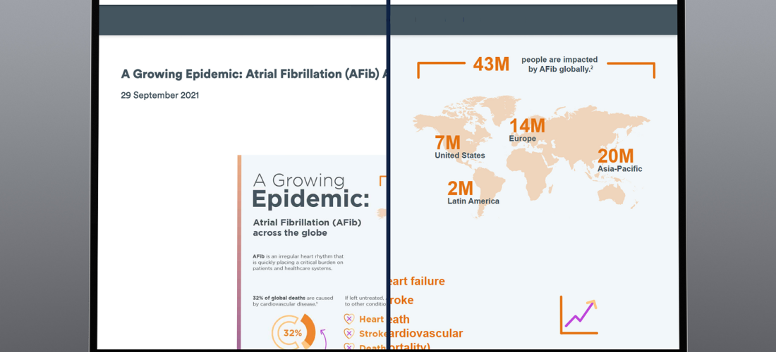
Featured image for the accessible infographic case study.

From Static Image to Scalable Solution

Featured image for the accessible infographic case study.

Role

Lead UX Designer

Product

Enterprise Infographic Framework (Design System Extension)

Timeframe

Summer 2022, 2–3 Sprints

Team:
Cross-functional collaboration with product manager, business analyst, engineers, QA’s, content, marketing partners, UX Leads

Tools:
Adobe XD, internal CMS, accessibility testing tools (VoiceOver, WebAIM Contrast Checker), WCAG documentation


A Small Request With a Bigger Problem

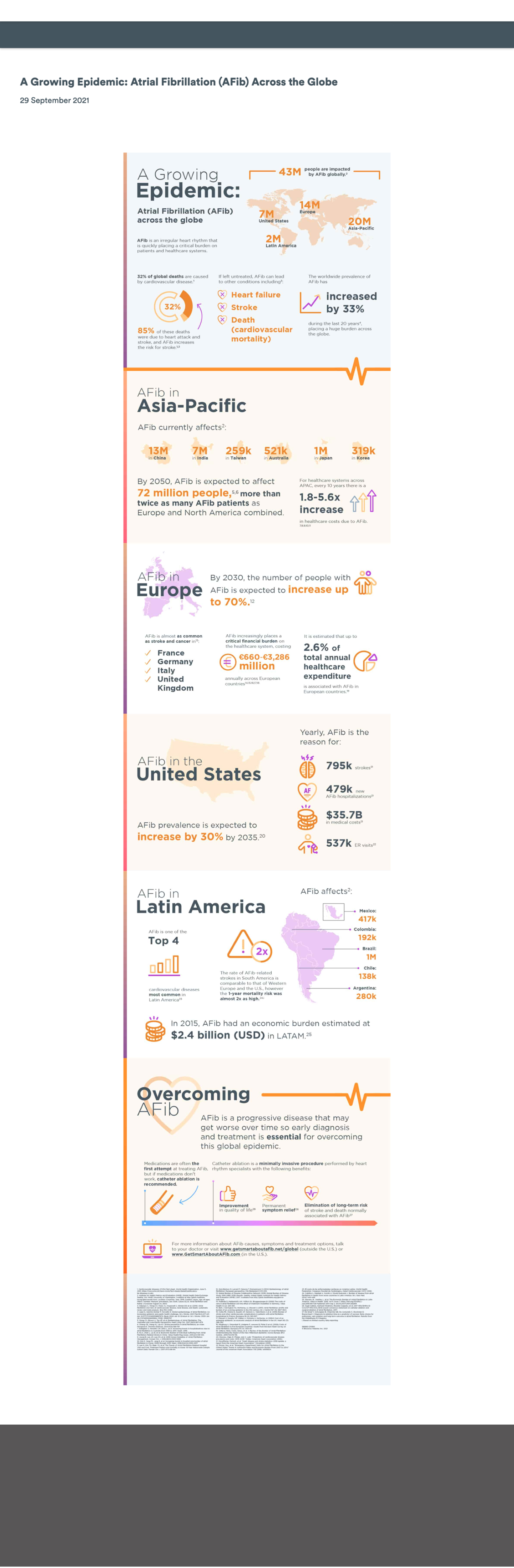
Marketing wanted an infographic published immediately on their site. It was a flat image packed with insights from a large global study. This was the kind of content that earns shares, citations, and backlinks. The design was done, their timeline was tight, and they just needed our team to push it live. I said yes reluctantly, already seeing how it would quietly work against everything they were trying to achieve:

  • On mobile, the image would be nearly unreadable
  • Screen readers would find nothing to scan
  • Search engines would index the file but not the content inside it
  • Any future update would have meant rebuilding the whole image from scratch.

For me, the real issue was reach. Locking that much valuable research into a static image meant it was effectively invisible to users with access needs, and to the search engines that would determine how many people ever found it. The content was strong, but the format was about to bury it.

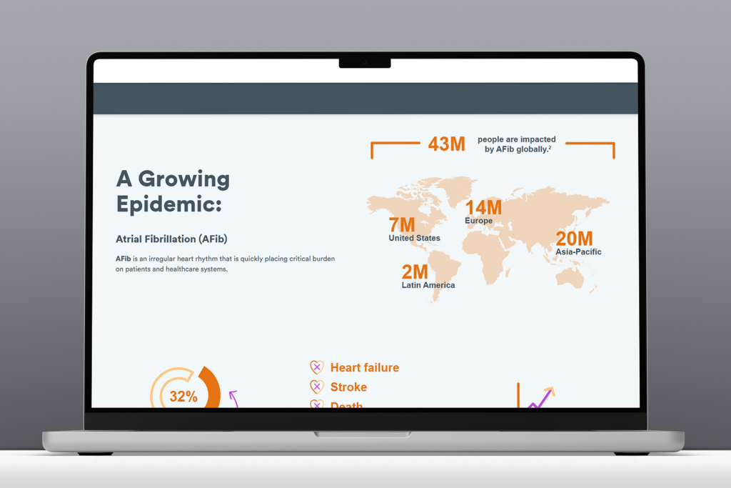
Desktop view of the original static infographic prior to redesign for accessibility.
Original flat infographic on desktop
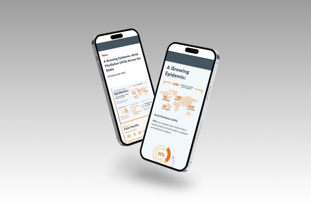
Mobile view of the original static infographic prior to redesign for accessibility.
Original flat infographic on mobile

The Real Opportunity

Before flagging issues and moving on, I wanted to understand what the team was actually trying to accomplish. They wanted to promote a conference tied to the research, drive interest in related content on the site, and get the work discovered organically. That last goal opened the conversation.

I asked how they expected people to find a flat image through search. Being marketing professionals, the SEO implications landed immediately. Embedding this much content in a static image was effectively hiding it from search engines. The case made itself: if the goal was reach and discoverability, the format was working against them.

Once the SEO point clicked, they were immediately on board with exploring a different approach. I proposed a flexible, live solution that would be searchable, scalable, and built to grow. They aligned quickly, especially knowing more infographic content was planned ahead. 

With stakeholder support secured, I brought the proposal to the other project design leads — presenting the use case, my proposed solution, and the platform-wide benefit of building a reusable framework any team could use to present visual data in a flexible, accessible, on-brand way. During the meeting, I facilitated a quick brainstorm that surfaced additional use cases from other team leads, which I used to strengthen the prioritization argument. Nothing like this existed in the system. I made the case that it should, and got the buy-in to build it. What started as one marketing request now had a clear case for becoming a system-level capability.


The Goal

Transform a one-off accessibility risk into a reusable system solution, enabling infographic content to be built using modular, WCAG-compliant components that improve accessibility, SEO, and scalability across all supported brands.


Finding the Solution Inside What Already Existed

Framework showing steps to design accessible, reusable infographic content with research, iteration, and cross-team collaboration.

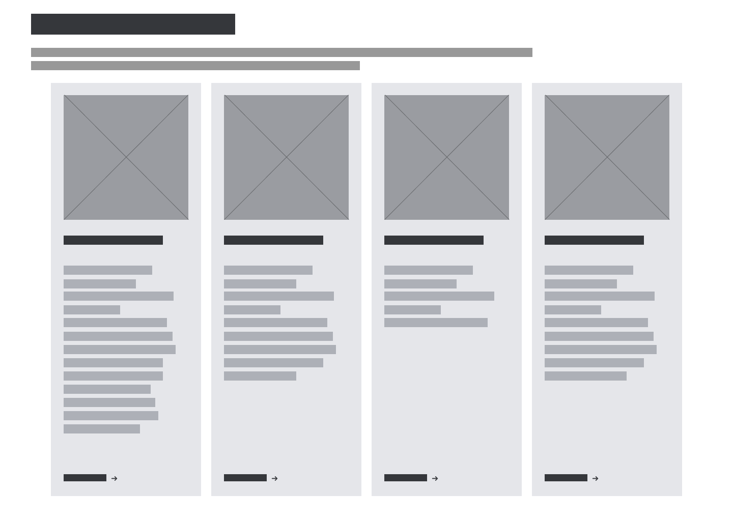
My first instinct was to look at what the design system already had. An existing card-based module showed genuine potential. The structure was close to what an infographic layout would need, but too rigid for complex data storytelling.

Before touching a single screen, I brought engineering into the conversation to understand what the existing module could realistically support and where it would need to flex. That early alignment meant we weren’t designing into constraints we’d only discover during development. This was a decision that kept the project on track and avoided costly rework later.

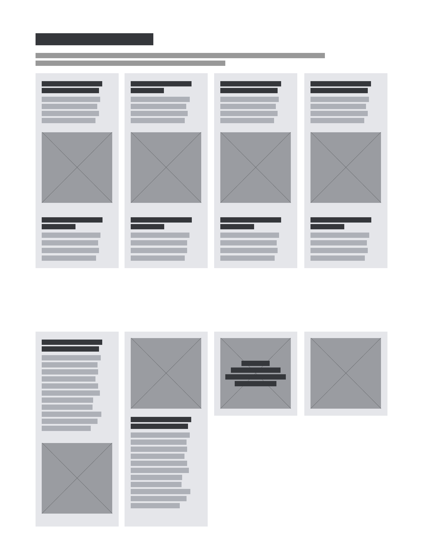
What I designed was an enhanced version of that module — purpose-built to handle the range of configurations infographic content actually requires. Every decision served a specific outcome: flexible image and text configurations to support varied content types, a non-carousel layout to preserve logical reading order for screen readers, and scalable card layouts that could flex from a single stat to a full data narrative. The result was a component that worked for content teams, met compliance standards, and could scale across brands without redesign.

Wireframe of the original system module that informed the enhanced infographic module.
Baseline system module wireframe prior to infographic enhancements.
Example wireframe of enhanced design system module supporting accessible, flexible infographic layouts.
Wireframe example of enhanced system module for infographic layouts

Accessibility was a constraint from the start. In collaboration with engineering: real text instead of embedded image text, semantic HTML structure, keyboard-accessible interactive elements, and meaningful alternative text throughout. These decisions improved both compliance and search performance across devices and assistive technologies.


Getting Teams Across the Finish Line

Building the component was one part of the work. The other was making sure teams could use it without calling a designer every time.

I recognized that a well designed component wouldn’t be enough if teams didn’t know how to use it, so I developed a comprehensive infographic toolkit designed to make content teams self-sufficient without needing to pull in a designer for every request.

I walked the content team through the toolkit in full. The volume of questions told me the guidance was landing. For business partners, I focused specifically on asset preparation and handoff, making sure they understood their role in getting the right file types to the content team. Across stakeholders, the toolkit was received as genuinely useful. System documentation was updated across platforms, with open office hours available for ongoing questions.

Example of framework and guidance tool used for creating accessible, system-ready infographic content
Example of an infographic toolkit framework guiding accessible content creation

What It Added Up To

A WCAG-compliant infographic framework — reusable across multiple brands, maintainable by content teams without developer involvement, and built entirely on an existing system component. Content that had previously been locked inside a flat image was now live, searchable, and indexable. Teams could update infographic content without filing a developer request. And the framework was built to scale — meaning the next team with an infographic need had a starting point, not a blank page

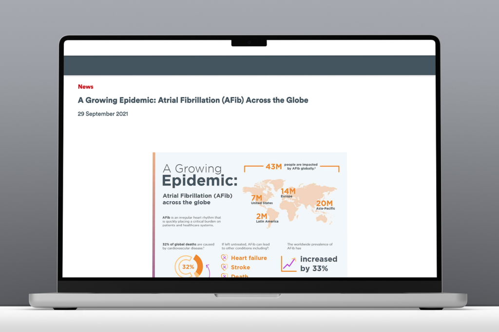
Original flat-image infographic embedded on the page before accessibility improvements.
Original flat-image infographic prior to accessibility enhancements
Dynamic infographic demonstrating improved flexibility and accessibility through the new system framework.
Updated accessible infographic with improved flexibility and dynamic content
Before-and-after comparison of the infographic on mobile, showing improved readability and accessibility.
Mobile view comparison of the original and accessible infographic

The toolkit generated interest from teams well beyond the original request. Which was the point.


What I Learned

A flat image was easy to ship, but building something that would serve teams better for years required broader thinking. It’s the kind of investment that’s worthwhile, especially when two other teams later adopted the framework without any design support, which was exactly the point.

The key takeaway for me was to start with the goal, not the deliverable. The team came to me with a finished design and a simple request to publish the content. Instead, the more important question was if this format would actually work for what what they were trying to accomplish? Asking this instead was what changed the entire trajectory of the project, and prevented a valuable piece of research from being buried in a format no one would find.

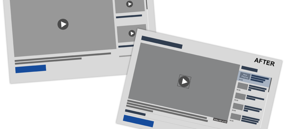
Video Playlist Module Comparison2

When Compliance Requires More Than a Fix

Image showing a Before & After comparison of the Video Module that this case study focuses on.

Role

Lead UX Designer

Product

Enterprise Design System

Timeframe

6 sprints

Collaborators:
Product Managers, Business Analysts, Developers, QA, Accessibility Vendor Partner

Tools:
Adobe XD, internal CMS, accessibility testing tools (VoiceOver, WebAIM Contrast Checker), WCAG documentation


The Module That Couldn’t Be Patched

Our enterprise design system was undergoing a full accessibility overhaul. Most modules needed targeted fixes. The video player was different. Over the years, it had accrued technical debt to the point where it lacked features most modern video players offer by default, let alone what was needed to meet WCAG compliance.

I was asked to lead the redesign of this module. The challenge wasn’t just design execution. It was understanding the system deeply enough to advocate for the right path forward, working across engineering, product, QA, and an external accessibility partner to get there.

The existing player had no keyboard navigation, no transcripts, no closed captioning, no playlist timestamps, and no “Now Playing” indicator — issues that went beyond accessibility and affected general usability for all users.


Finding the gaps before designing the solution

Video Player Scope Process Flow Diagram
Video Player Scope Process Flow

I began with a combined design discovery and heuristic analysis — mapping every place the existing player fell short, both from an accessibility standpoint and from basic usability best practices. This wasn’t just a compliance checklist. I wanted a holistic picture of what the experience should be.

The audit produced a prioritized list of features needed, each tied back to a specific accessibility issue or UX gap:


Feature Issue Addressed WCAG Criterion
Keyboard Navigable Controls Users who cannot operate a mouse have no way to play, pause, adjust volume, or seek through video content. 2.1.1 Keyboard (A)
Keyboard Navigable Playlist Playlist items are not reachable or operable via keyboard, preventing non-mouse users from selecting videos. 2.1.1 Keyboard (A)
Selectable Playlist Items Without focusable, activatable items, screen readers cannot identify or interact with playlist content meaningfully. 2.1.1 Keyboard (A)
4.1.2 Name, Role, Value (A)
Closed Captioning Deaf and hard-of-hearing users have no access to spoken audio content in any form. 1.2.2 Captions — prerecorded (A)
Transcript Functionality Users cannot read, search, or reference spoken content, affecting deaf users and those in noise-sensitive environments. 1.2.3 Audio description or media alternative (A)
Autoplay Controls Automatic media playback can disorient screen reader users and interfere with assistive technology audio output. 1.4.2 Audio control (A)
2.2.2 Pause, stop, hide (A)
Now-Playing Indicator Screen readers receive no signal about which video is currently active, making playlist navigation ambiguous. 4.1.2 Name, Role, Value (A)
1.3.1 Info and relationships (A)
Playlist Timestamps Users relying on screen readers have no way to gauge video duration before selecting, reducing content discoverability. 1.3.1 Info and relationships (A)
Video Count Assistive technology users have no context for how many items are in a playlist, making navigation unpredictable. 1.3.1 Info and relationships (A)
2.4.6 Headings and labels (AA)

WCAG 2.1 criteria shown. Level A = minimum compliance; Level AA = enhanced compliance and common legal standard.

Once I had the complete list, I brought it directly to our accessibility vendor partner. We went through each item together — I explained the specific issue I believed it addressed, and we confirmed which changes would genuinely move the needle on compliance. That external validation was essential before I could make a case to engineering and leadership.


When “patch it” isn’t an option

With a confirmed feature list in hand, I brought the proposal to the engineering lead and relevant stakeholders. I provided annotated examples of each change alongside context for how they’d address specific issues — making sure the ask was grounded and legible, not just visual.

The module had been built and updated incrementally for years. Making all the required changes without a full rebuild wasn’t feasible. A full rebuild meant a significant timeline delay — one that would threaten our end-of-year target for a compliant design system. Rather than stall, I went back to the engineering lead with a different question: which features could be implemented without a rebuild?

They identified four that were achievable in the existing codebase: keyboard navigation for controls and playlist, selectable playlist items, and transcript and closed captioning support. I returned to the accessibility vendor with this scoped list, and they confirmed it would achieve basic compliance — with full compliance following in a planned Phase 2.

By reframing the engineering limitation as a phased plan, we kept the project moving, protected the compliance goal, and created space for a proper rebuild without sacrificing momentum.


A plan the whole team could commit to

With alignment from engineering, the accessibility partner, and stakeholders, I proposed a two-phase structure that balanced delivery speed with design integrity.

Phase 1: MVP

Achievable without rebuild

Basic compliance achieved, and shippable within existing sprint cadence.

  • Keyboard navigable controls
  • Playlist navigable controls
  • Selectable playlist items
  • Closed captioning and
  • Transcript functionality

Phase 2: Full Rebuild

Complete feature set

Full compliance and elevated experience for all users. New module build implementing all remaining features:

  • Autoplay controls
  • Playlist timestamps
  • Video count,
  • “Now Playing” indicators
  • Full keyboard interaction model

Turning a feature list into an experience

Over the course of a week, I translated the feature requirements into a fully realized design — thinking through interaction states, edge cases, and how each new element would communicate meaning to both sighted users and screen reader users simultaneously.

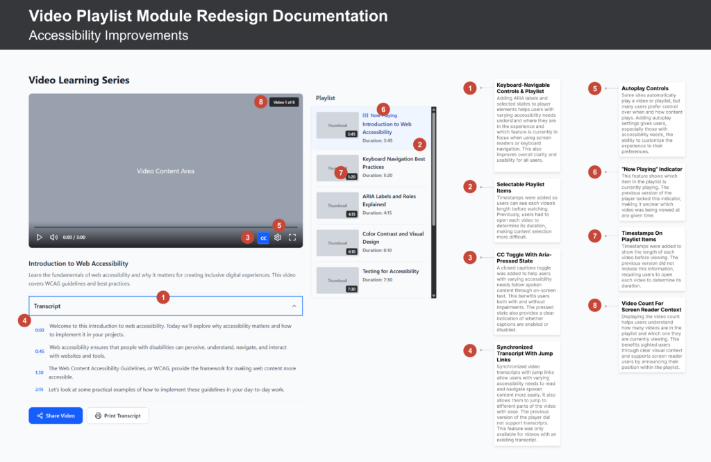
The graphic below showcases the redesigned Phase 2 player. I designed the interaction states for keyboard users first, then confirmed they held up for mouse users — rather than the other way around.

Annotated screenshot of video player design showcasing all of the accessibility upgrades incorporated.
Annotated screenshot of video module accessibility upgrades

Final Feature List

  • Keyboard-navigable controls & playlist
  • Animated now-playing indicator
  • Timestamps on all playlist items
  • Synchronized transcript with jump links
  • CC toggle with aria-pressed state
  • Video count for screen reader context
  • Incorporated aria-selected & aria-label on playlist items

I walked the team through the designs at the next sprint planning meeting. I covered interactions, states, and edge cases, and set up standing weekly office hours for any questions that surfaced during implementation.


Working Through Implementation

The most effective work didn’t happen in design files, it happened in real-time feedback loops during implementation. I stayed in daily contact through standups and messaging, reviewing builds in progress and catching issues before they became rework.

Phase 1 shipped

Keyboard navigation, selectable playlist, captions and transcripts implemented. Basic compliance achieved. QA completed collaboratively with the engineering team to verify against design specs and assistive technology behavior.

Phase 2 complete rebuild

Full module rebuild incorporating all remaining features. Consistent real-time communication meant no major issues arose during development — any questions were resolved the same day.

Design system updated

Updated designs and documentation added to the system immediately post-release. As with all modules in this overhaul, I kept the source of truth aligned with what was publicly shipped throughout the project — not as a final step, but as an ongoing practice.


Compliance, craft, and a better experience for everyone

sprints to ship Phase 1 with basic compliance

new features designed & delivered across two phases

major issues during implementation — resolved in real time

The rebuilt module met full WCAG compliance, was added to the design system as a documented, maintained component, and perhaps just as importantly, became a model for how the team could approach phased delivery on complex, constrained projects.

The features added were no longer just checkbox compliance items, they made the module measurably better for every user.

Example of design system documentation screens.
Example of design system documentation

What I’d carry into the next one

When engineering flagged that the existing player needed a full rebuild, that wasn’t a setback, it was a design input. Working within that constraint led to a phased structure that made sense for everyone involved. From there, the most consequential design work happened not in the files, but in conversations with the accessibility vendor, the engineering lead, and key stakeholders. Bringing annotated examples into those discussions, rather than relying on verbal descriptions alone, made alignment significantly faster and kept things moving.

The accessibility requirements that came out of those conversations turned out to make the player better across the board. Keyboard navigation, transcripts, now-playing indicators — every feature added for compliance also improved the experience for all users (sighted and non-disabled). The strongest case for accessible design isn’t what it fixes, but what it unlocks.

Design System Screenshot

Scaling Accessibility

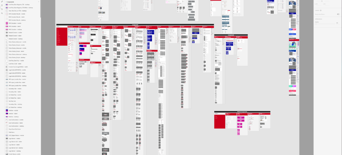
Zoomed out image of design system file showing the various parts that the system consists of.

Role

Lead UX Designer

Product

Global Design System

Timeframe

6-month engagement

Team: Product manager, business analyst, engineers, QA, content, marketing partners, UX leads, and external accessibility partners

Tools: Adobe XD, Jira, Confluence, Slack, VoiceOver, TalkBack, internal QA and testing environments, third-party accessibility validation services


When One Market Goes Dark

An international franchise site went offline. Not because of a server failure or a bad deployment, but because it couldn’t meet its government’s digital accessibility requirements.

On the surface, it looked like a regional problem. However, as the picture became clearer, the realization settled in that the core design system components powering that site were the same ones running across every other market. The same carousel that trapped screen readers in an infinite loop. The same modules with missing ARIA labels and failing color contrast. The same structural gaps, just quietly waiting to surface somewhere else.

This wasn’t a regional compliance issue anymore. It was a system-wide risk that had gone unexamined. The franchise had lost web presence and revenue. Users with disabilities couldn’t navigate key content. And the product team had to stop everything else to respond.

When leadership saw the full picture, the response was immediate. Everything else was deprioritized, and I was asked to lead the remediation, and to define what a compliant, scalable design system would look like going forward. Not just for the market that surfaced the problem, but for the entire system.

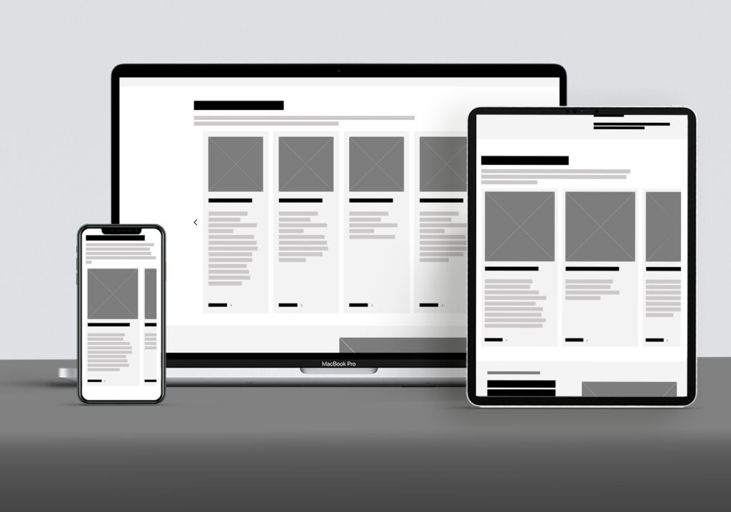
Responsive views of a design system module on desktop, tablet, and mobile prior to accessibility enhancements.
Carousel module wireframes showing a non accessible layout.

The Goal:

Evolve the global design system into an accessible, inclusive foundation — meeting WCAG 2.1 AA standards, supporting international compliance requirements, and giving regional teams components they could deploy with confidence.


How I Approached It

My instinct was to get straight into design work, because there was a lot of pressure to move fast. But we didn’t have a clear picture of what was actually broken yet, so I pushed to start with the audit.

Accessibility experts were brought in to provide guidance with auditing the most commonly used modules. The audit surfaced two kinds of problems: things we could fix in one sprint (quick wins – contrast corrections, missing alt text, incomplete ARIA labels), and things that needed to be rebuilt (structural issues – broken keyboard navigation, focus management that confused screen readers, and semantic hierarchies that needed to be rebuilt entirely).

I collaborated with my product manager, business analyst and engineering lead to establish a prioritization framework weighted by severity, frequency of use across global markets, user impact, and implementation complexity — and used it to build the remediation roadmap that sequenced work across the engagement. High-risk, high-traffic modules moved first; everything else was scoped into a longer-term plan. Before any design work began, I defined and documented accessibility and functional requirements for each component, grounded in WCAG 2.1 AA, expert recommendations, and engineering constraints. This helped prevent rework, kept the cross-functional team aligned across sprints, and ensured that compliance wasn’t interpreted differently by design, engineering, and QA.


Doing the Work

Process workflow illustrating the steps used to evolve the design system to WCAG AA compliance: audit, prioritize, define requirements, research, design and iterate, validate, document, release, and govern.

Design was iterative and collaborative. I worked alongside engineering daily — sharing prototypes early, resolving implementation questions in real time, and surfacing blockers immediately so they could be addressed in the moment and not just waiting for reviews.

Most modules followed common patterns, defined content boundaries to prevent screen reader traps, improved semantic structure, logical keyboard navigation, and clearer labeling throughout. None of these changes made the experience harder for sighted users. Most made things better for everyone.

The card carousel was one of the hardest to update. Years of feature upgrades had made it one of the most powerful modules in the system, and one of the most complex to work with under the hood. When I brought the audit findings to engineering, the reaction was honest: the codebase was already stretched, and the required changes were extensive — removing infinite scrolling, adding ARIA labels, focus states, progress indicators, proper list structure, landmark regions, touch target sizing, arrow key navigation, and a maximum card count.

Rather than treat the list as an undifferentiated problem, I worked with the engineering lead and our accessibility vendor to sequence the work into three phases: basic accessibility first, full AA compliance second, best-practice enhancements third. Each phase was scoped to two sprints, and I kept myself available throughout — daily standups, direct messaging, office hours — so questions were resolved the same day they surfaced.

Annotated wireframe of a design system module highlighting accessibility issues.
Wireframe showing design system module prior to accessibility improvements
Annotated wireframe showing accessibility improvements made to a design system module.
Annotated wireframe of design system module after accessibility improvements

After development, every module went through functional QA, CMS integration testing, keyboard-only navigation reviews, automated scans, and manual screen reader testing with NVDA, VoiceOver and TalkBack. Nothing shipped until it passed. Six sprints later, nine new features had been added to the carousel and the module achieved full WCAG AA compliance on schedule.


Beyond the Fix: Building for the Long Term

Remediation was only half the job. The other half was making sure the same problems couldn’t quietly accumulate again.

Once each module was approved, it went back into the design system with updated documentation — usage guidelines, anatomy and behavior descriptions, accessibility requirements, dos and don’ts, and updated design assets. And beyond the documentation, I helped establish an accessibility governance model: regular reviews of core components, validation requirements for new contributions, engineering checkpoints, and a centralized process for reporting issues.

The goal was to make accessibility proactive rather than reactive. Not something you bolt on when a market goes dark, but something built into how the system works.

Accessibility governance lifecycle diagram illustrating how standards are maintained across the design system through audits, issue tracking, remediation, and education and training.

What It Unlocked

Of the system’s 15–20 modules, I led the remediation of 9 high-priority components — clearing the milestone a month ahead of schedule, which created time for a final compliance review before the international site relaunched. That relaunch restored the franchise’s web presence in that market. The remaining modules were addressed in a subsequent phase, and by the end of the following year, every component in the system had been brought to WCAG 2.1 AA compliance, reducing systemic risk across all global markets served by the design system.

By the end of the engagement, the broader system had a set of remediated core components, updated documentation, an internal accessibility checklist distributed across product teams, and external validation confirming WCAG 2.1 AA-level compliance.

More than the deliverables, though, what shifted was how the team thought about accessibility. It went from being a compliance checkbox (something someone else handles), to a shared responsibility embedded in how everyone worked. By the end, team members were catching accessibility issues themselves before they reached QA. That hadn’t been true at the start.


What I Took From It

Before this project, my accessibility expertise was real but surface-level. But by the end of six months, I was leading reviews, mentoring peers, and advocating for accessibility to be a shared expectation across disciplines, not a specialty siloed to one person.

The clearest lesson this project taught me is that often, making something accessible makes it better in ways that had nothing to do with accessibility. Better semantic structure, clearer content, more logical navigation. Nearly every change we made for compliance made the system measurably better for everyone using it.