From Static Image to Scalable Solution

Featured image for the accessible infographic case study.

Role

Lead UX Designer

Product

Enterprise Infographic Framework (Design System Extension)

Timeframe

Summer 2022, 2–3 Sprints

Team:
Cross-functional collaboration with product manager, business analyst, engineers, QA’s, content, marketing partners, UX Leads

Tools:
Adobe XD, internal CMS, accessibility testing tools (VoiceOver, WebAIM Contrast Checker), WCAG documentation

Purpose:

This case study shows how accessibility-first thinking and design system principles aligned design, development, and marketing to evolve an existing component into a scalable, accessible system capability.


Overview / Context

While contributing to an enterprise design system that supports multiple brands across a regulated industry, I partnered closely with marketing teams to extend the system’s capabilities in support of data-driven content.

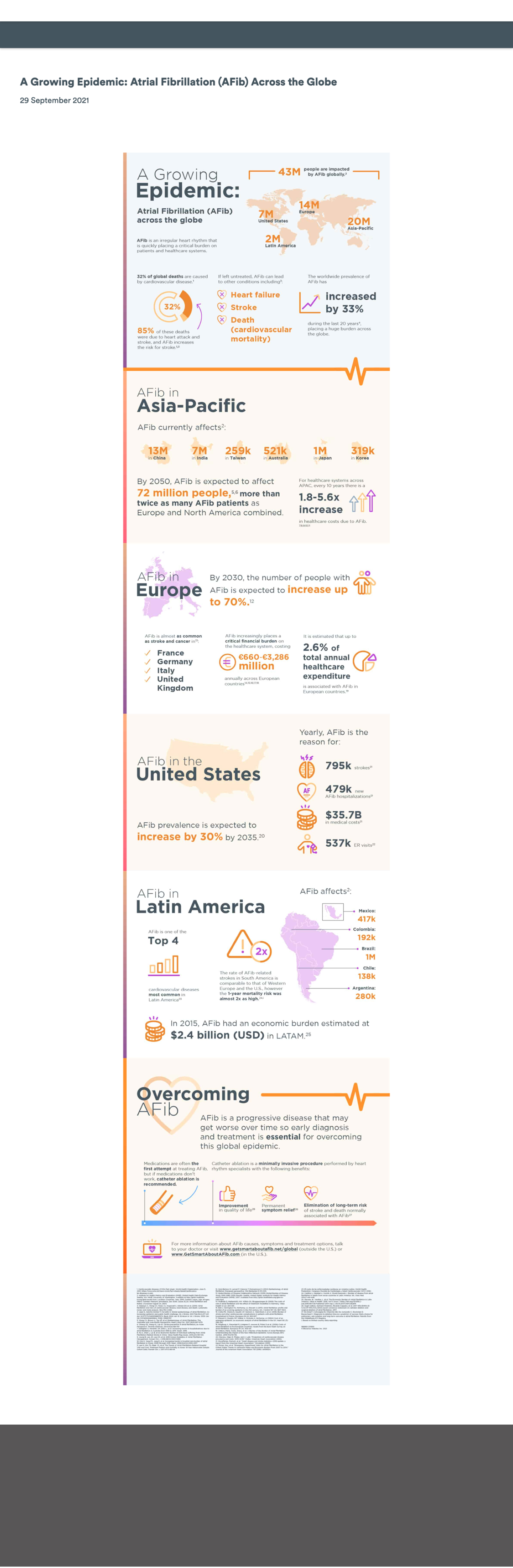
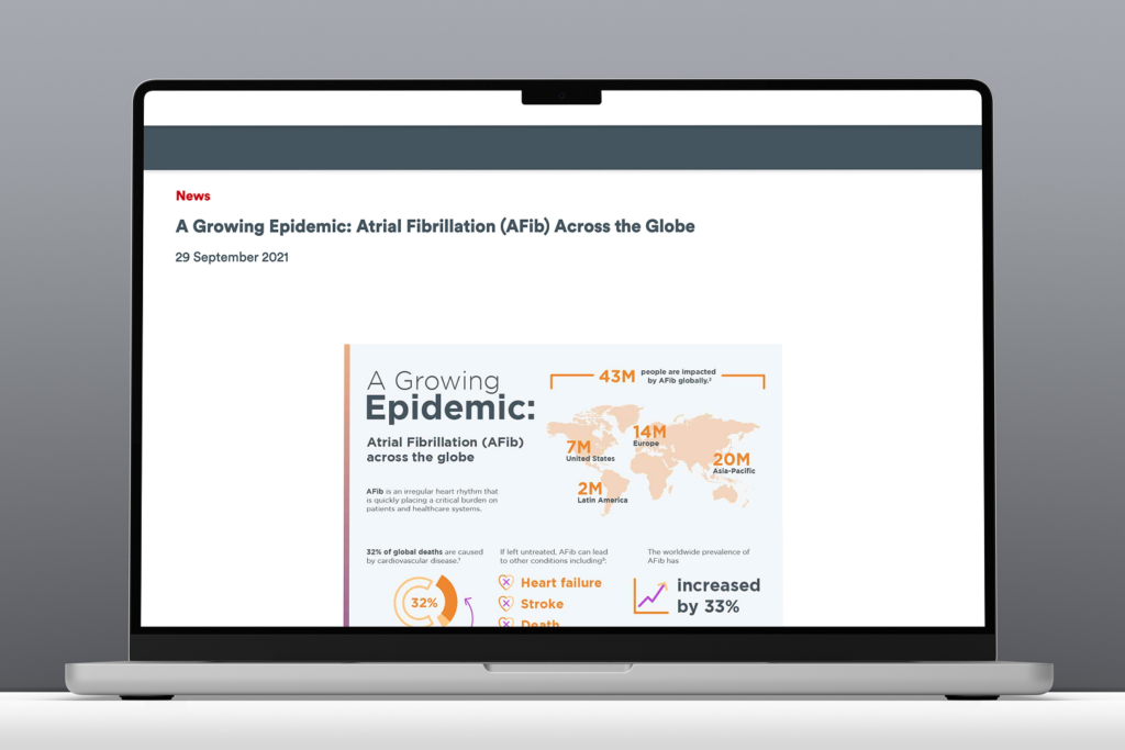
One particularly rewarding collaboration surfaced a request to publish a new infographic highlighting insights from a large-scale global study. What initially appeared to be a straightforward, last-minute content update quickly revealed broader accessibility, usability, and scalability challenges. Addressing those challenges ultimately led to a system-level solution that improved how infographic content could be created, maintained, and reused across teams.


Problem / Opportunity

The Immediate Issue

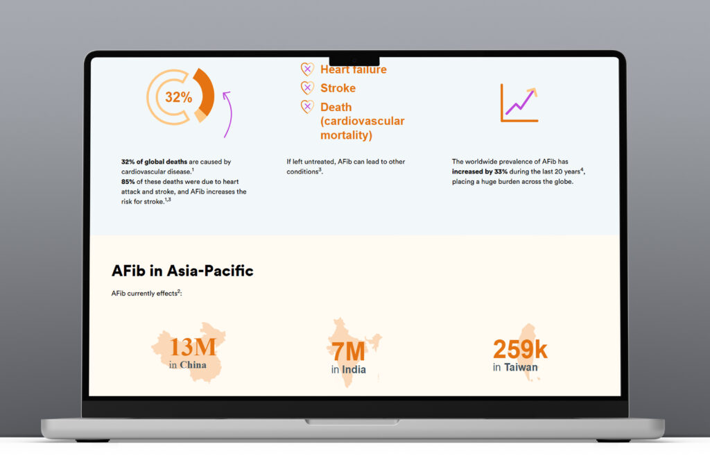
The initial infographic was delivered as a single flat image intended to be embedded directly on a marketing page. While quick to launch, this approach introduced several critical UX and accessibility issues:

  • Embedded text was not readable by screen readers
  • Color contrast issues reduced readability
  • Content did not scale effectively on smaller screens
  • Text and data were not indexable for search engines
  • Future updates would require re-creating and re-uploading imagery

Business & User Impact

The content represented valuable research, but in its static form it was difficult to discover, inaccessible to assistive technologies, and misaligned with accessibility and brand standards. This limited its reach, usability, and long-term value.

Opportunity:

Transform a one-off accessibility risk into a reusable, system-level solution by enabling infographic content to be built using modular, WCAG-compliant design system components that improve accessibility, SEO, and scalability.

Desktop view of the original static infographic prior to redesign for accessibility.
Original flat infographic on desktop
Mobile view of the original static infographic prior to redesign for accessibility.
Original flat infographic on mobile

Goals & Approach

Goals:

  • Create an accessible, flexible infographic framework using existing design system components
  • Enable content teams to update and manage infographic content without developer support
  • Improve SEO and discoverability of data-driven marketing content
  • Promote accessibility and scalability across all supported brands

Approach:

  1. Audit existing design system modules for reuse potential
  2. Research best practices for digital, accessible infographics
  3. Conduct technical feasibility discussions with developers
  4. Prototype enhanced components with accessibility built in
  5. Create a comprehensive infographic toolkit to guide consistent implementation

Design System Principles:

  • Scalability: Adaptable to various brands and layouts
  • Accessibility: WCAG-compliant design and content patterns
  • Flexibility: Configurable modules for storytelling and data presentation

Process

Framework showing steps to design accessible, reusable infographic content with research, iteration, and cross-team collaboration.

Audit & Research

I began by reviewing existing design system components, focusing on a card-based module that showed potential for reuse. In parallel, I also revisited WCAG guidance related to:

  • Text alternatives for image-based content
  • Keyboard navigation and logical focus order
  • Text contrast and responsive scalability

Early conversations with engineering confirmed that while parts of the existing module could be leveraged, additional flexibility would be required to accommodate more dynamic infographic layouts.
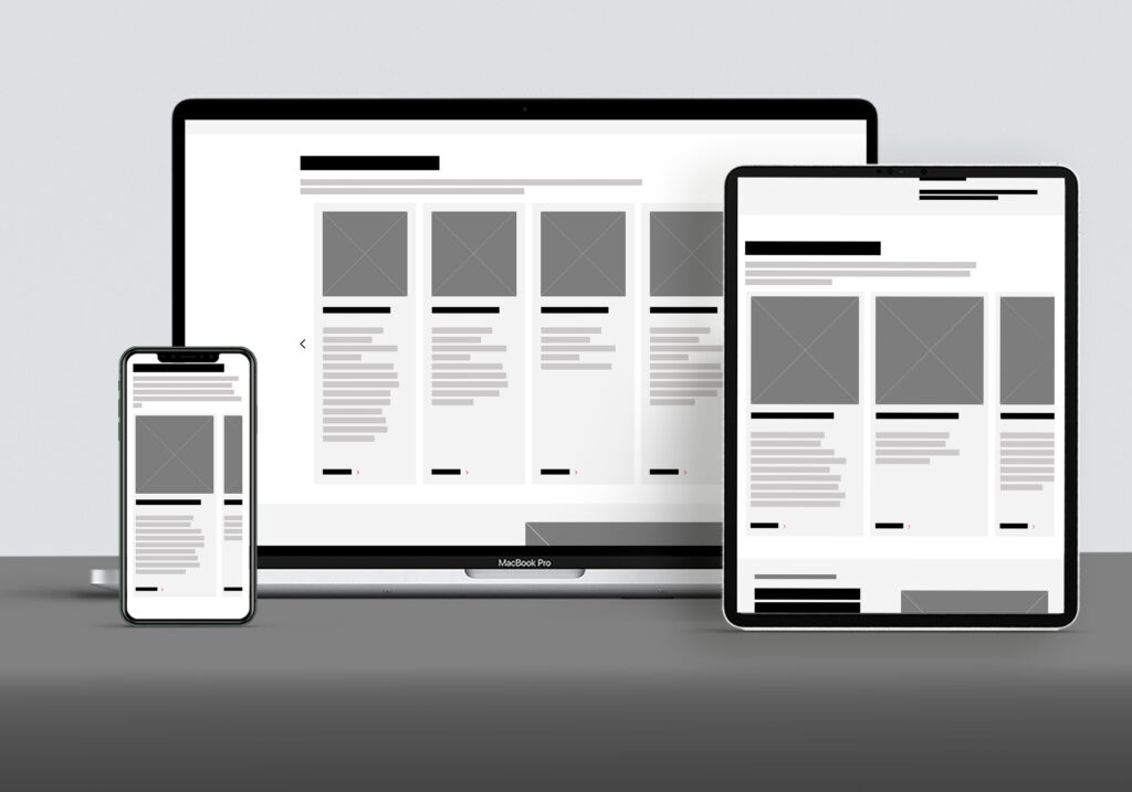
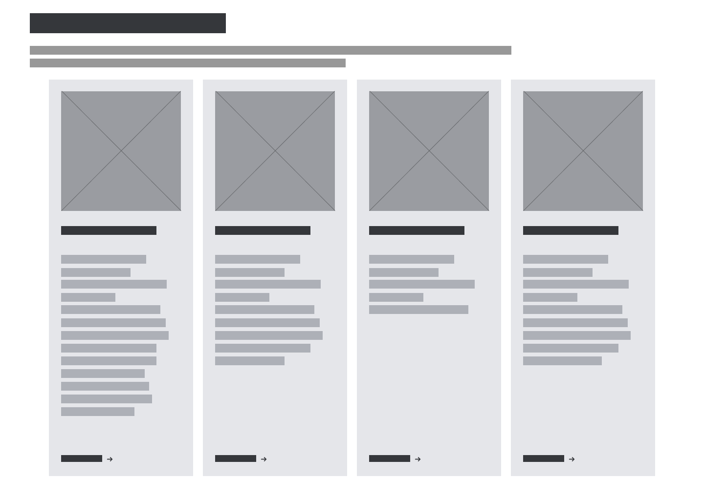
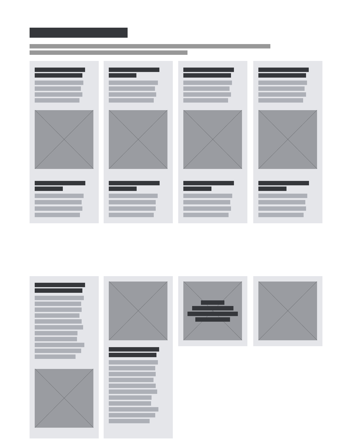
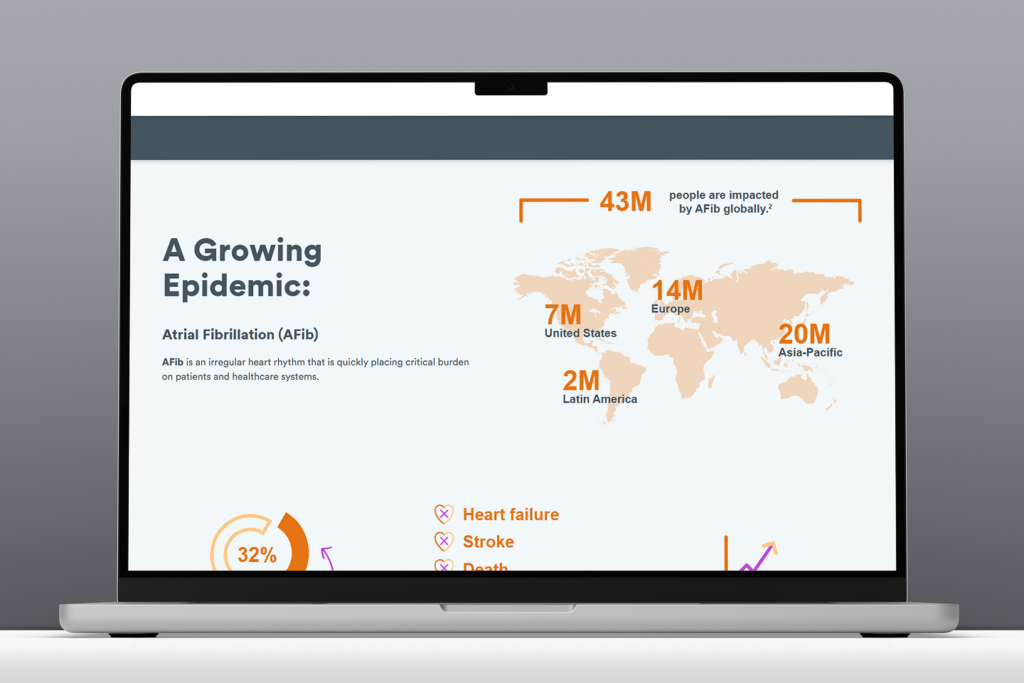
Accessibility guidelines document framework detailing semantics, interactions, content, and visual best practices
Framework document defining accessibility standards for component design.

Design & Iteration

The existing card-based module was designed for simple marketing content and lacked the flexibility needed for more complex infographic structures.

To address this, I designed an enhanced version of the module that supported:

  • Image with or without text overlay
  • Headers positioned above or below imagery
  • Optional descriptive text areas above and below
  • Configurations ranging from 1 – 8 cards
  • A non-carousel layout to preserve reading order

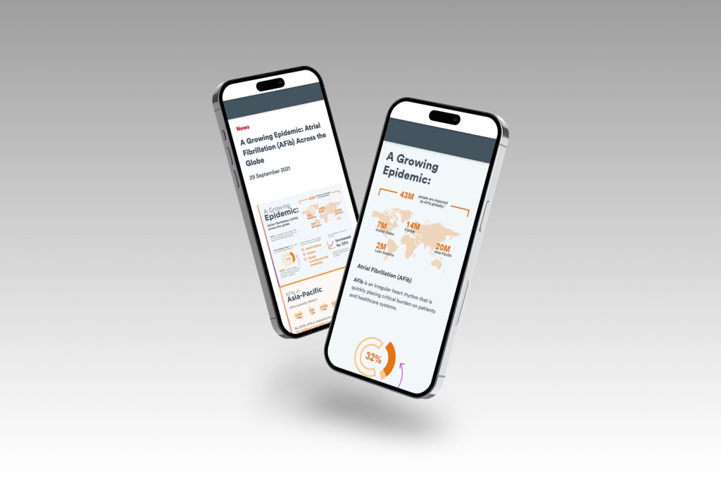
All enhancements increased layout flexibility, maintained accessibility compliance, and ensured content could be read in a logical sequence by screen readers and navigable via keyboard.

Wireframe of the original system module that informed the enhanced infographic module.
Baseline system module wireframe prior to infographic enhancements.
Example wireframe of enhanced design system module supporting accessible, flexible infographic layouts.
Wireframe example of enhanced system module for infographic layouts

Accessibility Integration

Accessibility was at the core of every design decision. In collaboration with engineering, we ensured that:

  • Interactive elements were fully keyboard accessible
  • Content followed semantic HTML structure
  • Images included meaningful alternative text
  • Real text was used instead of text embedded in imagery

These decisions improved both accessibility and search performance while ensuring consistent behavior across devices and assistive technologies.

Collaboration & Buy-In

After aligning with marketing stakeholders, I worked with design system peers and product partners to secure cross-functional support and prioritization. Because the initiative aligned with broader accessibility and scalability goals, it received strong buy-in and was positioned to benefit multiple teams beyond the original request.


Deliverables

Enhanced Card Module

  • Scalable for multiple infographic types
  • Flexible layout configurations
  • Accessibility-first functionality
Screenshot showing the enhanced infographic module in use.

Infographic Toolkit

A comprehensive resource to guide teams in creating accessible infographic content:

  • Recommended design system modules
  • Visual examples and layout guidance
  • SEO and image optimization best practices
  • Accessibility checklist (real text, alt text, vector art use)
  • External resources for inclusive design
Example of framework and guidance tool used for creating accessible, system-ready infographic content
Example of an infographic toolkit framework guiding accessible content creation

Documentation & Training

  • Updated system documentation across design and content platforms
  • Individual walkthroughs and open office hours for marketing teams

Outcomes & Learnings

This project underscored how a seemingly small design request can spark meaningful system-level change can surface broader system gaps—and how addressing those gaps can deliver lasting value..

Outcomes:

  • Designed WCAG compliant infographic framework
  • Created reusable guidance and tooling for future requests
  • Improved accessibility and usability of data-driven content
  • Increased discoverability through improved SEO practices
  • Received positive feedback from cross-functional partners

Key Learnings:

  • Converting static or print-based infographics into digital, accessible formats requires early planning
  • Developer collaboration early in discovery saves time
  • Clear visual documentation increases adoption and reduces need for support
  • Accessibility improvements often create broader UX and SEO benefits
  • Constructive pushback—grounded in evidence—can lead to innovation
Original flat-image infographic embedded on the page before accessibility improvements.
Original flat-image infographic prior to accessibility enhancements
Dynamic infographic demonstrating improved flexibility and accessibility through the new system framework.
Updated accessible infographic with improved flexibility and dynamic content
Before-and-after comparison of the infographic on mobile, showing improved readability and accessibility.
Mobile view comparison of the original and accessible infographic

Final Thoughts

Key Takeaway:

This initiative transformed a last-minute content request into a scalable, accessible design system capability, resulting in a more flexible, inclusive, and SEO-friendly way to present infographic content.

Next Steps:

  • Expand the module to support additional data-visualization patterns
  • Extend the toolkit to address motion and interactive infographics
  • Integrate automated accessibility checks into publishing workflows

Scaling Accessibility

WCAG Level AA compliance graphic highlighting the four principles: perceivable, operable, understandable, and robust.

Role

Lead UX Designer

Product

Global Design System

Timeframe

6-month engagement

Team: Cross-functional collaboration with product manager, business analyst, engineers, QA’s, content, marketing partners, UX Leads, and external accessibility partners

Tools: Adobe XD, Jira, Confluence, Slack, assistive technologies (ie. VoiceOver, TalkBack), internal QA and testing environments, and third-party accessibility validation services

Purpose:

Evolve the existing global design system into an accessible, inclusive foundation that supports international markets and meets WCAG AA standards.


Overview / Context

The global design system supports a large network of international, franchise-based marketing sites. Because these sites serve diverse audiences across multiple regions, they must meet a range of regional digital accessibility requirements that extend beyond U.S.-centric standards.

In mid-2023, one international market identified significant accessibility gaps that prevented their localized site from meeting required standards. While the issue surfaced at a regional level, it revealed a broader system-level challenge: core design system components were not consistently WCAG-compliant.

As a lead UX designer on the design system, I was asked to lead a multi-month initiative to modernize the system, remediate accessibility gaps, and establish a sustainable, accessibility-first foundation that could support compliance across global markets.


Problem / Opportunity

What originally appeared to be a regional compliance issue exposed a greater systemic risk. The design system lacked core accessibility standards, which posed increasing compliance risk as its use expanded across global markets.

Pain Points

  • Non-compliant modules: Missing ARIA labels, poor color contrast, infinite scrolls that trapped screen readers.
  • Brand and usability risk: The outage damaged brand perception and trust in international markets.
  • System-wide exposure: The same inaccessible components were being reused globally.

Impact

  • Business: The franchise lost web presence and revenue until compliance was restored.
  • Users: Visitors with disabilities were unable to navigate key content.
  • Teams: The product team needed to reprioritize all work to address accessibility first.
Responsive views of a design system module on desktop, tablet, and mobile prior to accessibility enhancements.
Carousel module wireframes showing a non accessible layout.

Goals & Approach

Goals

  • Enable international sites to meet WCAG AA standards
  • Remediate the most frequently used and highest-risk design system components
  • Embed accessibility into the system’s core principles and workflows
  • Equip regional teams with accessible, reusable modules they could confidently deploy

Approach

  1. Partner with external accessibility experts for auditing, guidance, and validation
  2. Prioritize high-traffic and high-usage modules for immediate remediation
  3. Collaborate across design, engineering, and product through agile sprints
  4. Validate all remediated components prior to release

Design System Principles Introduced:

  • Accessibility-first thinking
  • Consistency across markets
  • Scalable, future-ready patterns
  • Strong cross-functional collaboration

Collaboration

I worked closely with product and engineering partners throughout the engagement through:

  • Daily standups to address blockers and alignment
  • Sprint reviews to share findings and design recommendations
  • Slack and open office hours for design handoff and Q&A
  • Testing walkthroughs to ensure visual and functional parity with designs

This cadence ensured transparency, reduced rework, and supported delivery within the project timeline.


Process

Process workflow illustrating the steps used to evolve the design system to WCAG AA compliance: audit, prioritize, define requirements, research, design and iterate, validate, document, release, and govern.

1. Audit

We began with a comprehensive audit of the most commonly used design system modules. Components were evaluated using a combination of automated scans and manual WCAG reviews.

The results revealed both surface-level issues and deeper structural gaps that required refactoring, and not just visual fixes alone.

Findings were organized into:

  • Quick Wins: Contrast corrections, font size adjustments, missing alt text, incomplete ARIA labels.
  • Structural Issues: Interaction patterns, focus management, semantic hierarchy, and keyboard traps.

2. Prioritize

Components were prioritized based on:

  • Severity of accessibility violations
  • Frequency of use across global markets
  • User impact
  • Implementation complexity
  • Compliance risk for specific regions

High-risk, high-usage components were addressed first, with lower-impact items added to a longer-term roadmap.

3. Define Requirements

Before redesigning any module, clear accessibility and functional requirements were documented, informed by:

  • WCAG 2.1 AA standards
  • Accessibility expert recommendations
  • Engineering constraints and CMS considerations
  • UX best practices
  • Regional compliance considerations

Requirements were organized into categories including:

  • Semantics & Structure (e.g., list vs. div structure, heading levels)
  • Interaction Patterns (keyboard support, focus order, arrow behaviors)
  • Content Requirements (alt text guidance, ARIA labels, descriptive text)
  • Visual Standards (contrast minimums, spacing, type scale)

This step ensured that the cross-functional team was aligned before design work began.

Accessibility requirements document outlining semantic structure, interaction patterns, content guidelines, and visual standards used to inform component design.
Requirements shown are representative and generalized for confidentiality.

4. Research

I conducted focused research to ensure design decisions would be grounded in best practices and user needs. This included:

Accessibility Standards & Best Practices
Reviewed WCAG 2.1 AA guidelines and patterns from accessibility-forward design systems to validate semantic structure and interaction patterns.

Benchmarking Industry Examples
Analyzing how similar components were implemented across trusted organizations to identify pitfalls and proven solutions.

User & Behavioral Insights
Referencing analytics and engagement data to understand how real users interacted with high-traffic modules and where accessibility issues created friction.

Assistive Technology Review
Documenting how components were announced by screen readers to uncover labeling gaps, missing semantics, and keyboard challenges.

Engineering Considerations
Validating constraints around CMS structure, localization needs, and technical feasibility to ensure designs were realistic and sustainable.

This research ensured every design decision was informed, intentional, and aligned with both user expectations and compliance standards.

5. Design & Iterate

I led the design updates for high-priority modules, including complex, high-traffic modules.

Through iterative design, I introduced improvements including:

  • Defined content limits and clear start/end points
  • Improved semantic structure for assistive technologies
  • Clear navigation patterns with visible states
  • Explicit labeling and guidance for accessible content
  • Visual indicators that improved usability for all users

I partnered closely with engineering from design through development, sharing prototypes and interaction details, and participating in daily standups to ensure accurate implementation and rapid issue resolution.

6. Validate (QA + AT Testing)

After development, each module entered a rigorous validation process that combined:

Functional QA

  • Component-level testing
  • CMS integration testing
  • Responsive layout checks
  • Keyboard-only navigation reviews

Accessibility Testing

  • Automated scans
  • Manual screen reader testing
  • Focus state and focus order validation
  • Color contrast verification

Issues were tracked, resolved, retested until all acceptance criteria were met, before release approval.

Validation workflow diagram outlining functional QA and accessibility testing steps used to verify correct implementation of design system enhancements.

7. Document

Once approved, I added each module back into the design system with:

  • Updated usage guidelines
  • Anatomy and behavior descriptions
  • Accessibility requirements
  • Dos and don’ts with examples
  • Updated design assets

This ensured long-term consistency, clarity, and adoption across regional teams.

Annotated wireframe of a design system module highlighting accessibility issues.
Wireframe showing design system module prior to accessibility improvements
Annotated wireframe showing accessibility improvements made to a design system module.
Annotated wireframe of design system module after accessibility improvements

8. Release

Module releases followed a structured rollout plan:

  • Updated design libraries and release notes
  • Internal announcements and walkthroughs
  • Optional office hours for review and guidance
  • Staged deployment
  • Post-release testing to ensure parity between design and production

9. Govern

To ensure ongoing compliance and prevent regressions, an accessibility governance model was established, including:

  • Regular accessibility reviews of core components
  • Validation requirements for new components
  • Engineering checkpoints
  • A centralized process for reporting issues or requesting enhancements
  • Ongoing monitoring of regional requirements

Governance ensures that accessibility is no longer reactive — it is proactively maintained and embedded as part of the design system’s lifecycle.

Accessibility governance lifecycle diagram illustrating how standards are maintained across the design system through audits, issue tracking, remediation, and education and training.

Deliverables

  • Remediated Components: Core components redesigned/rebuilt to be WCAG AA compliant.
  • Documentation Updates: Revised system documentation for accessibility.
  • Accessibility Guidelines: Internal checklist and training shared across product teams.
  • Validated Compliance: External validation confirming AA-level compliance.
  • Successful Relaunch: International marketing site restored to full operation and compliance.

Impact & Results

  • Enabled an international site to meet required accessibility standards and return to active status.
  • Empowered product team to build accessible products with confidence and consistency.
  • Improved usability for users with and without disabilities
  • Established accessibility as a core design principle for the global system going forward.

“The updates didn’t just bring us into compliance — they made our design system better for everyone.”

– Product Manager

Reflection

This initiative completely reshaped how I think about inclusive design.

Key Takeaways:

  • Build it right from the start – Retrofitting accessibility is far more time-consuming than designing for it initially.
  • Audit regularly – Continuous monitoring prevents regressions and regional compliance issues.
  • Accessibility = good design – Improvements that help one group of users typically improve usability for all.
  • Transparency drives success – Open communication throughout the process was crucial for alignment and delivery.

Before this project, my accessibility expertise was surface-level. By the end, I was confidently leading reviews, mentoring peers, and ensuring accessibility became a shared responsibility across disciplines.