
NDA Notice:
This case study uses abstracted or representative examples to illustrate design approach and decision-making rather than proprietary systems or internal documentation. Public-facing work is shown for illustrative purposes only.
Role
Lead UX Designer
Product
Enterprise Infographic Framework (Design System Extension)
Timeframe
Summer 2022, 2–3 Sprints
Team:
Cross-functional collaboration with product manager, business analyst, engineers, QA’s, content, marketing partners, UX Leads
Tools:
Adobe XD, internal CMS, accessibility testing tools (VoiceOver, WebAIM Contrast Checker), WCAG documentation
Purpose:
This case study shows how accessibility-first thinking and design system principles aligned design, development, and marketing to evolve an existing component into a scalable, accessible system capability.
Overview / Context
While contributing to an enterprise design system that supports multiple brands across a regulated industry, I partnered closely with marketing teams to extend the system’s capabilities in support of data-driven content.
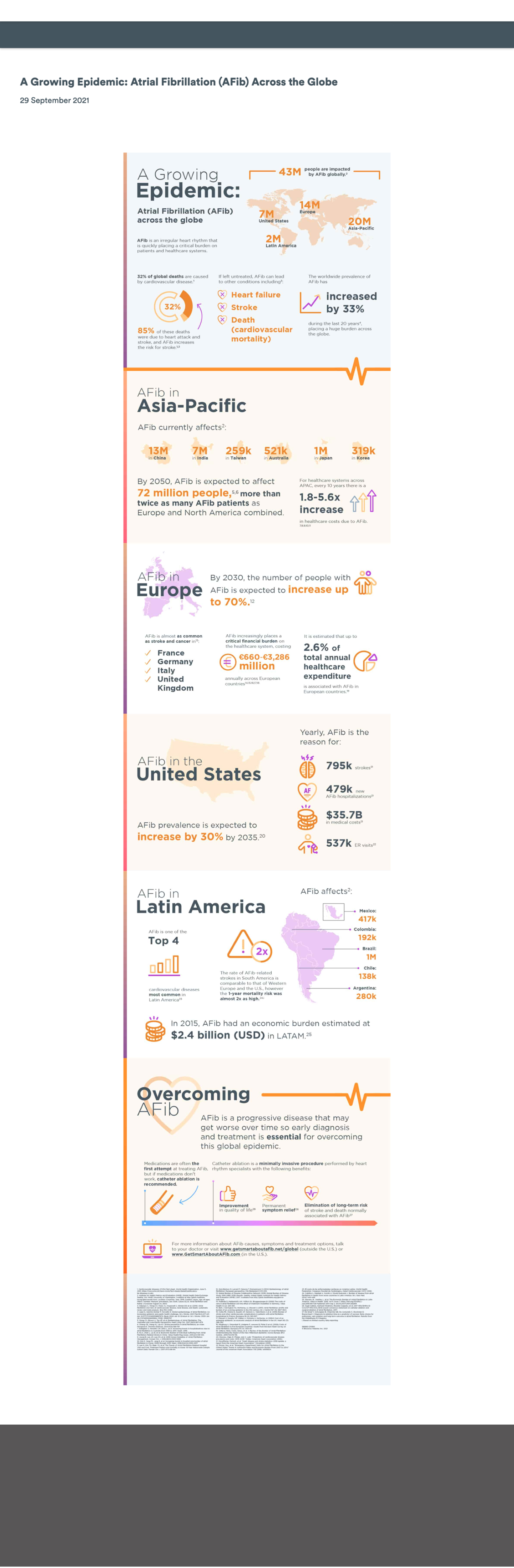
One particularly rewarding collaboration surfaced a request to publish a new infographic highlighting insights from a large-scale global study. What initially appeared to be a straightforward, last-minute content update quickly revealed broader accessibility, usability, and scalability challenges. Addressing those challenges ultimately led to a system-level solution that improved how infographic content could be created, maintained, and reused across teams.
Problem / Opportunity
The Immediate Issue
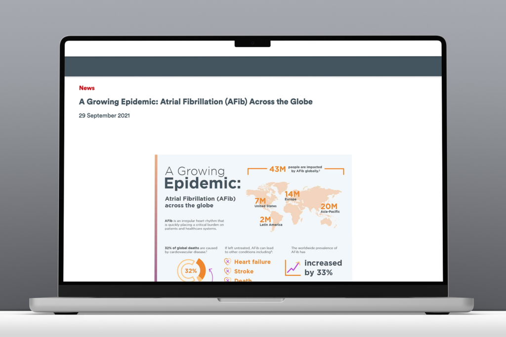
The initial infographic was delivered as a single flat image intended to be embedded directly on a marketing page. While quick to launch, this approach introduced several critical UX and accessibility issues:
- Embedded text was not readable by screen readers
- Color contrast issues reduced readability
- Content did not scale effectively on smaller screens
- Text and data were not indexable for search engines
- Future updates would require re-creating and re-uploading imagery
Business & User Impact
The content represented valuable research, but in its static form it was difficult to discover, inaccessible to assistive technologies, and misaligned with accessibility and brand standards. This limited its reach, usability, and long-term value.
Opportunity:
Transform a one-off accessibility risk into a reusable, system-level solution by enabling infographic content to be built using modular, WCAG-compliant design system components that improve accessibility, SEO, and scalability.

Goals & Approach
Goals:
- Create an accessible, flexible infographic framework using existing design system components
- Enable content teams to update and manage infographic content without developer support
- Improve SEO and discoverability of data-driven marketing content
- Promote accessibility and scalability across all supported brands
Approach:
- Audit existing design system modules for reuse potential
- Research best practices for digital, accessible infographics
- Conduct technical feasibility discussions with developers
- Prototype enhanced components with accessibility built in
- Create a comprehensive infographic toolkit to guide consistent implementation
Design System Principles:
- Scalability: Adaptable to various brands and layouts
- Accessibility: WCAG-compliant design and content patterns
- Flexibility: Configurable modules for storytelling and data presentation
Process

Audit & Research
I began by reviewing existing design system components, focusing on a card-based module that showed potential for reuse. In parallel, I also revisited WCAG guidance related to:
- Text alternatives for image-based content
- Keyboard navigation and logical focus order
- Text contrast and responsive scalability
Early conversations with engineering confirmed that while parts of the existing module could be leveraged, additional flexibility would be required to accommodate more dynamic infographic layouts.

Design & Iteration
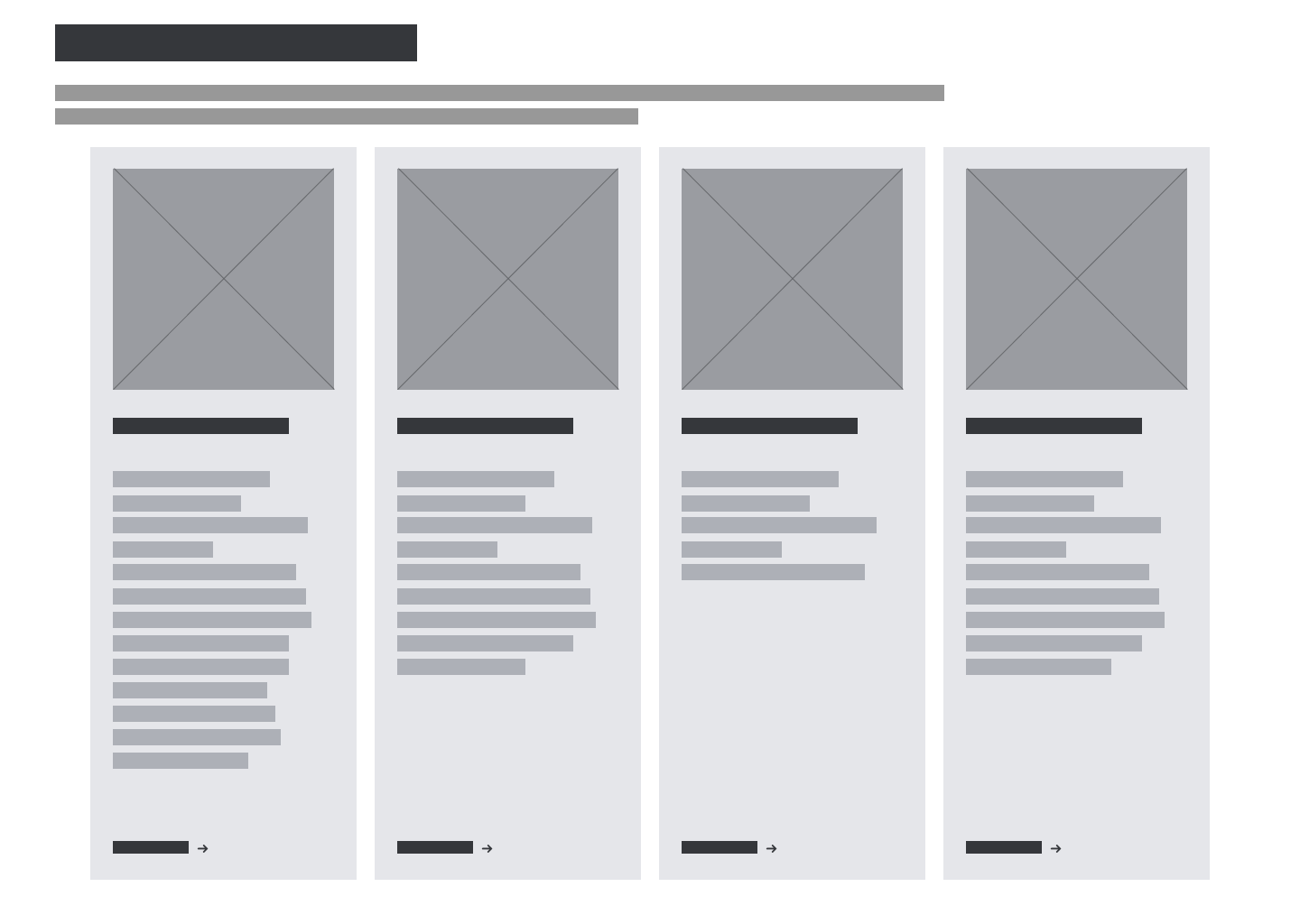
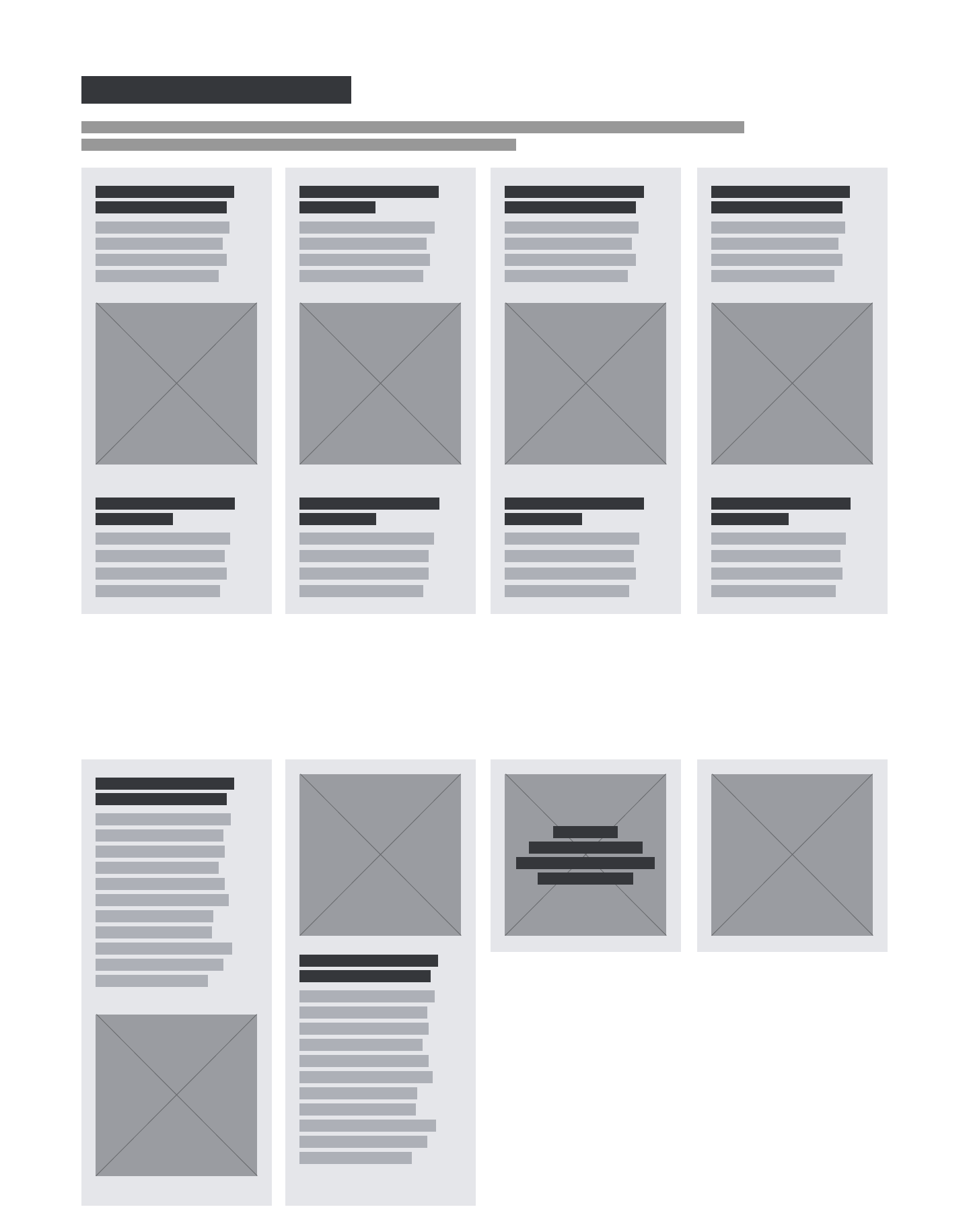
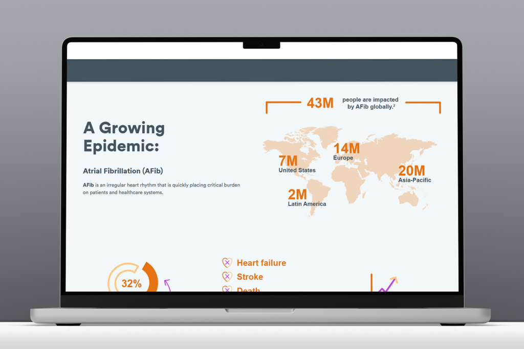
The existing card-based module was designed for simple marketing content and lacked the flexibility needed for more complex infographic structures.
To address this, I designed an enhanced version of the module that supported:
- Image with or without text overlay
- Headers positioned above or below imagery
- Optional descriptive text areas above and below
- Configurations ranging from 1 – 8 cards
- A non-carousel layout to preserve reading order
All enhancements increased layout flexibility, maintained accessibility compliance, and ensured content could be read in a logical sequence by screen readers and navigable via keyboard.
Accessibility Integration
Accessibility was at the core of every design decision. In collaboration with engineering, we ensured that:
- Interactive elements were fully keyboard accessible
- Content followed semantic HTML structure
- Images included meaningful alternative text
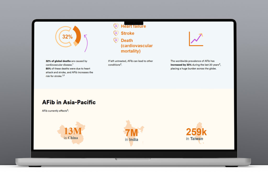
- Real text was used instead of text embedded in imagery
These decisions improved both accessibility and search performance while ensuring consistent behavior across devices and assistive technologies.
Collaboration & Buy-In
After aligning with marketing stakeholders, I worked with design system peers and product partners to secure cross-functional support and prioritization. Because the initiative aligned with broader accessibility and scalability goals, it received strong buy-in and was positioned to benefit multiple teams beyond the original request.
Deliverables
Enhanced Card Module
- Scalable for multiple infographic types
- Flexible layout configurations
- Accessibility-first functionality
Infographic Toolkit
A comprehensive resource to guide teams in creating accessible infographic content:
- Recommended design system modules
- Visual examples and layout guidance
- SEO and image optimization best practices
- Accessibility checklist (real text, alt text, vector art use)
- External resources for inclusive design

Documentation & Training
- Updated system documentation across design and content platforms
- Individual walkthroughs and open office hours for marketing teams
Outcomes & Learnings
This project underscored how a seemingly small design request can spark meaningful system-level change can surface broader system gaps—and how addressing those gaps can deliver lasting value..
Outcomes:
- Designed WCAG compliant infographic framework
- Created reusable guidance and tooling for future requests
- Improved accessibility and usability of data-driven content
- Increased discoverability through improved SEO practices
- Received positive feedback from cross-functional partners
Key Learnings:
- Converting static or print-based infographics into digital, accessible formats requires early planning
- Developer collaboration early in discovery saves time
- Clear visual documentation increases adoption and reduces need for support
- Accessibility improvements often create broader UX and SEO benefits
- Constructive pushback—grounded in evidence—can lead to innovation
Final Thoughts
Key Takeaway:
This initiative transformed a last-minute content request into a scalable, accessible design system capability, resulting in a more flexible, inclusive, and SEO-friendly way to present infographic content.
Next Steps:
- Expand the module to support additional data-visualization patterns
- Extend the toolkit to address motion and interactive infographics
- Integrate automated accessibility checks into publishing workflows